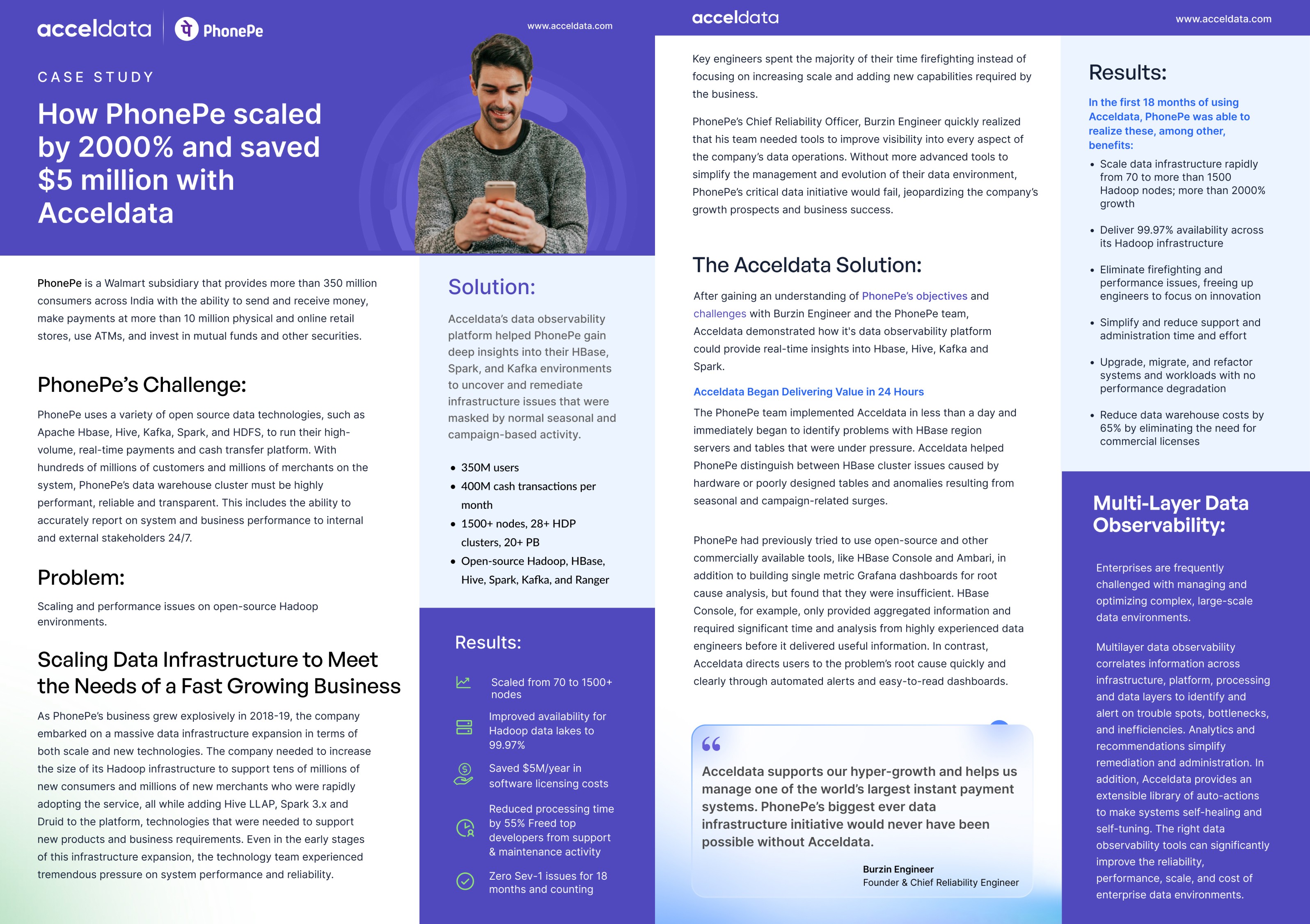
Creating 40 e-books and engaging Lottie GIFs, enhancing Acceldata’s visual identity across social media platforms and Website

Creating a cohesive visual narrative across digital platforms to amplify brand presence

Role

I was responsible for producing 40 e-books and incorporating engaging Lottie GIFs. These visual assets strengthened Acceldata’s brand presence across social media platforms and their website, ensuring a cohesive and impactful visual identity that resonated with their target audience.

a cell phone on a bench

Stage 1. Usability Audit

Initiated the project with a comprehensive usability audit of the existing app, employing heuristic evaluation, user interviews, and performance analytics to identify friction points. This audit revealed significant areas for improvement, particularly in the app's navigation system, goal tracking features, and social engagement mechanisms.

Stage 2. Design Strategy

Formulated a redesign strategy that prioritizes a simplified user flow, enhanced data visualization for goal tracking, and new features to foster community engagement among users. Developed a detailed design roadmap, categorizing changes into short-term fixes and long-term enhancements, to guide the redesign efforts effectively.

Stage 3. Prototype Development

  • Wireframing: Undertook the redesign of core app screens and user flows, addressing the audit's findings. Emphasized the creation of a more intuitive and goal-oriented user journey, reducing cognitive load and enhancing the overall user experience.


  • High-Fidelity Prototyping: Leveraged Adobe XD to construct detailed prototypes that brought the new design to life. These prototypes featured a refined aesthetic that aligns with the motivational needs of fitness enthusiasts, showcasing the app's enhanced functionality and interactivity.


  • User Interface Design: Revamped the app's visual identity, incorporating vibrant colors and dynamic elements that motivate users to engage with their fitness goals actively. Carefully selected typography and iconography that resonated with the app's target demographic, ensuring the interface is not only beautiful but also functional.

a cell phone on a bench
a cell phone on a table
a cell phone leaning on a ledge
a black cellphone with a white letter on it

Outcomes

The redesigned fitness tracker app received overwhelmingly positive feedback from users, who praised its improved usability, engaging design, and motivational features. The project was a significant learning opportunity, enhancing my understanding of user-centric design principles and the impact of design on user behavior and app retention.

Other projects

Pranav Presannan

Copyright 2024 by PranavPresannan

Pranav Presannan

Copyright 2024 by PranavPresannan

Pranav Presannan

Copyright 2024 by PranavPresannan