Elevating Factors AI: A Comprehensive Rebranding and Visual Design Solution for a Cohesive Brand Identity
Transforming Factors AI’s brand through a new website, compelling case studies, and visually striking social media and event designs.
Role
I played a pivotal role in transforming Factors AI’s brand identity. My responsibilities included revamping the entire website, creating visually engaging case studies and eBooks, designing LinkedIn live banners, thumbnails, booth displays for events, as well as crafting stickers and brochures. I took complete ownership of these projects, building them from the ground up to align with the brand's vision and marketing strategies.


Other projects
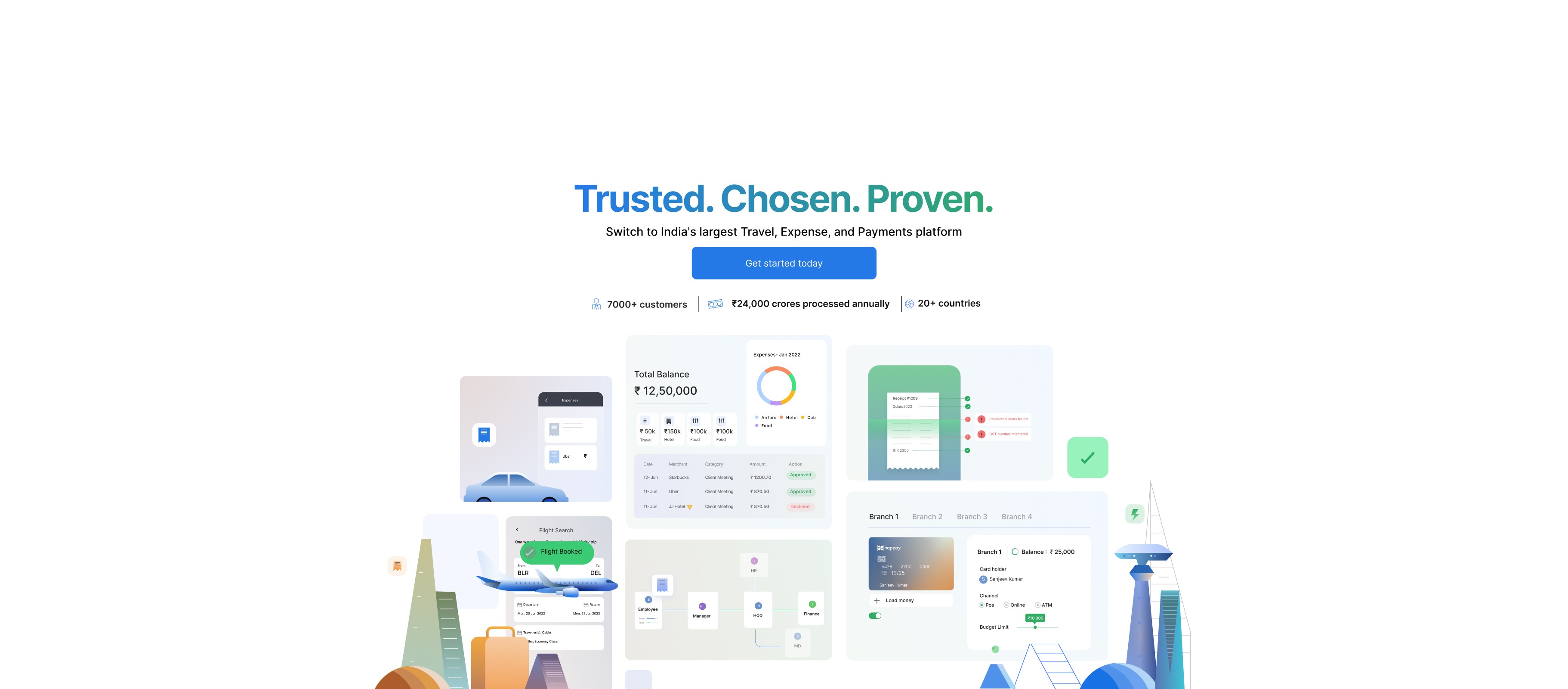
Enhancing Happay’s Website and Social Media with Illustrations
Designing impactful website illustrations and social media visuals to engage users and enhance brand presence, from concept to execution.
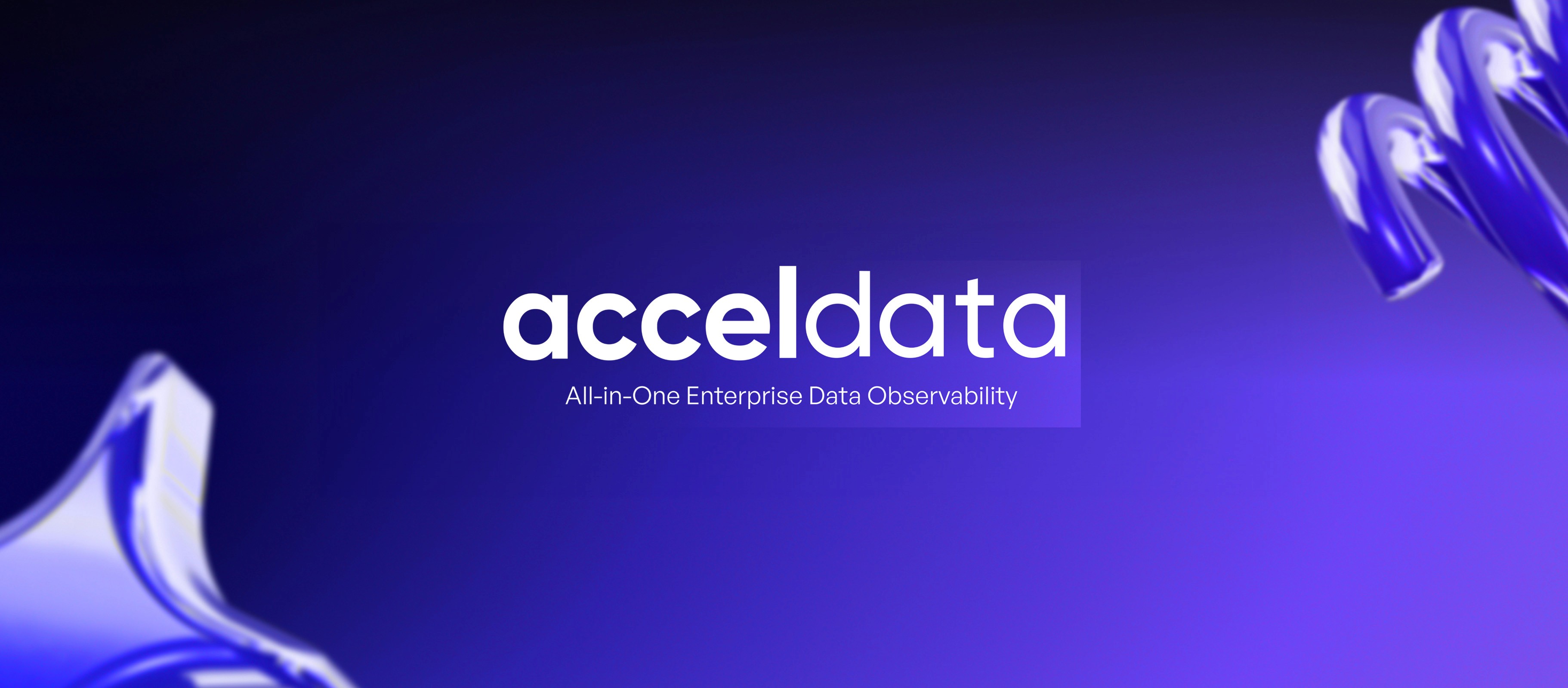
Creating 40 e-books and engaging Lottie GIFs, enhancing Acceldata’s visual identity across social media platforms and Website
Creating a cohesive visual narrative across digital platforms to amplify brand presence
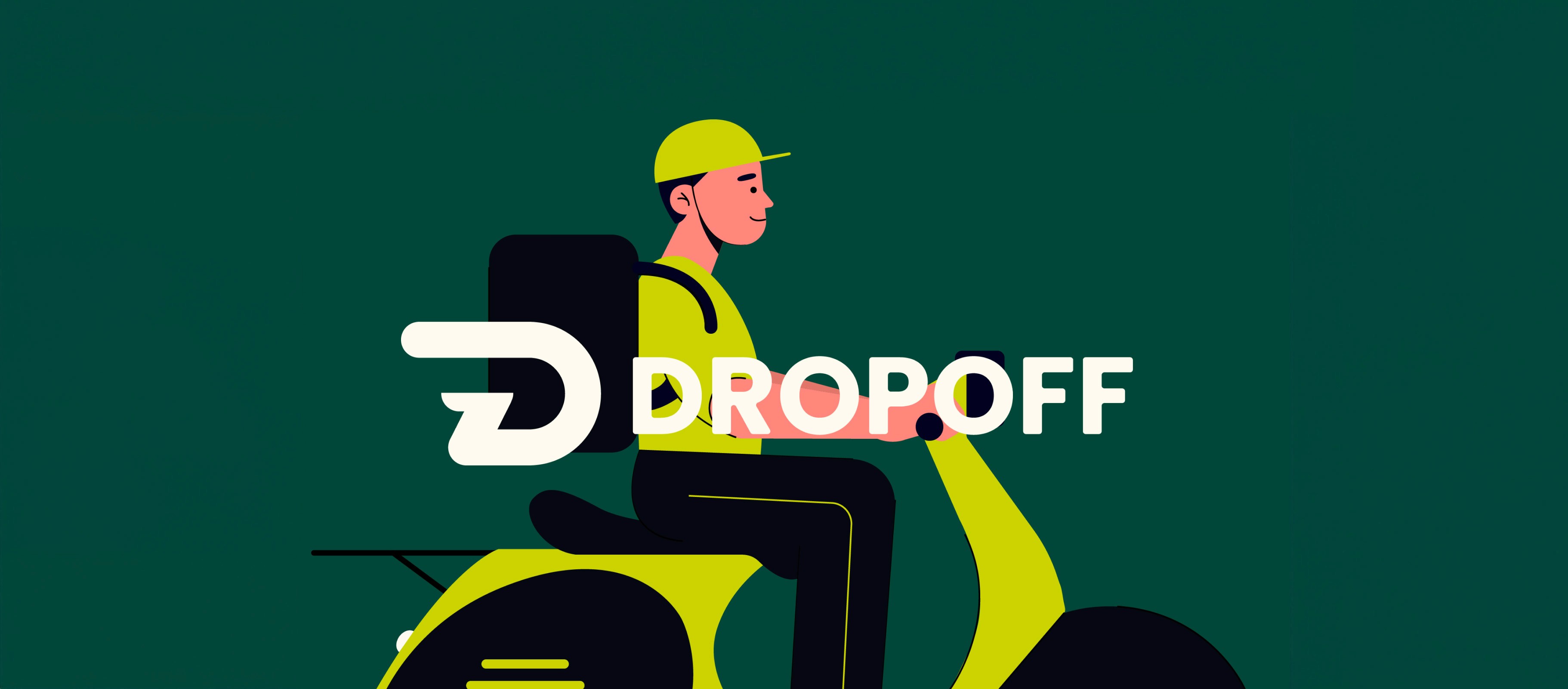
Bringing Convenience to Life: Designing Visuals for Dropoff’s Grocery and Food Delivery Service
Designing visuals to connect users with a seamless delivery experience